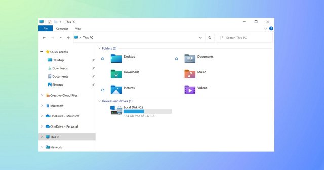
Introducing the Windows 10 Update named “Sun Valley”, Microsoft is going to bring a good handful of changes into the OS basic design. The most eye-catching modification with an effect on your apps is the rounded corners of the windows for Win32 and UWP apps – and all other WinUI-based apps.
The rounded-down corners are quite standard for various mobile OS. On the other hand, they aren’t a design feature easily spotted in Windows 10. Since the launch of Windows 10, all apps, tools, and other windows have boasted a design based on pronounced square or rectangular shapes.
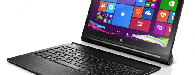
The earlier Windows versions (for instance, Windows 7 and Vista) indeed had rounded-down corners. Nonetheless, Microsoft’s approach changed after switching to its Metro UIs in Windows 8. This user interface relied mostly on sharp edges, straight lines, live tiles and apps convenient for touchscreen users.
However, Microsoft’s design team has recently decided to get rid of sharp corners in favor of rounded ones.
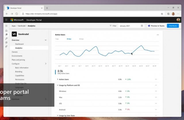
Apparently, Microsoft also has plans afoot to change the bezels around the controls: collapse, expand, and close.
As you can see in the above mockup, Microsoft is trimming the edges in applications such as Chromium Ege. They are getting replaced with smooth, rounded corners. To enhance the impression of rounded corners, Microsoft will also change the bezels for the window controls.
Besides, Microsoft published a mockup of Microsoft Teams and Outlook PWA for Windows, showing off the same rounded edges and bezel changes. Upon a closer look, you can notice that the corners of the application window are rounded.
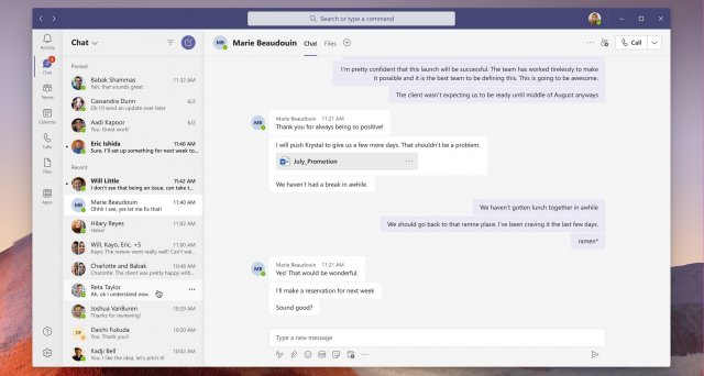
The present-day versions of Microsoft Edge, Teams, and Outlook come with clean lines and sharp corners. Such a design makes the apps look more formal and modern. This new sharp appearance differs it from macOS – the latter’s design language widely employs rounded corners.
Context menu with rounded corners
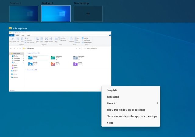
In preliminary builds, Microsoft discreetly enabled rounded corners and rounded edges for the context menu (the one brought up by the right mouse click) in Windows 10 Task View.
Expectedly, such modern-looking menus will find a wide application in the new user interface, replacing the classic context menus. The interface panels and menus will also boast rounded corners, and their overall appearance will bear a resemblance to macOS.
As you can see in the design concept presented below, Microsoft has been exploring a variety of other design changes for Windows applications: new icons, fonts, and animations.
![]()
Shortly before the June 24 event, the Microsoft enterprise applications, such as the Sysinternals tools, were updated to include the code that defines the upcoming OS theme colors and resources.
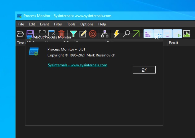
Apparently, these expanded tools, and other personalization options, will rely on resources that are not yet present in Windows 10 preliminary builds.

